Like most fountain pen enthusiasts, I own far too much ink.
I keep my ink collection in an old, wooden first aid box, the kind that would have been stationed on the wall of a warehouse or factory back in the 1980s. It's large enough to accommodate my bottles, some 20-odd strong. Looking through them, I see that I own three different brands of black ink. Why? After all, black is black, right? Well, not exactly. I bought one bottle of black ink (Diamine Onyx Black), then I bought a bottle of Noodler's Bulletproof Black, and some Pilot IC50 black cartridges for my black Capless. I am settled on the Noodler's now because of its water- etc resistance, and because it works quite well in the Capless. It is my ink of choice for those situations where I have to complete an official form. But then I bought a bottle of Sailor Jentle Grey ink. This fluid does not seem to like any of my pens, so there it sits, unused, and I haven't the gall to pour it down the sink.
Mostly the inks remain unused because I initially liked the colour, but then lost enthusiasm. Diamine Imperial Purple is a case in point, here. Purple is the colour of my old university and I had the bright idea that it would be nice to write in purple ink. Imperial Purple was suggested to me by my colleagues on the Fountain Pen Network so I bought a bottle. It is a nice ink, though I have since found that it fades to a dusty purple colour. This was not what I was looking for. I have since replaced it with another purple, well actually it's called violet on the bottle: Pelikan Violett. This is also the reason why I own several bottles of blue ink (Quink, Waterman, Pelikan, Diamine, Pilot).
Sometimes the inks remain unused because I love the colour but they take too long to dry because they are highly saturated. Private Reserve Plum is a good example. It is beautiful, but takes forever (seemingly) to dry on the page. As I detest smearing this is a big disadvantage.
Sometimes they are unused because they don't work in my pens or I simply haven't tried them in the right pen. Pelikan Turquoise springs to mind; it's a cool colour, behaves well, and yet it's yet to find a happy home in my pens. As a colour, it's a blue which reminds me of glaciers; it's the colour of icebergs. At the moment it lives in one of my Lamy Safaris.
Sometimes there are colours which I enjoy and then don't use for no particular reason. Diamine Orange is the one here. It is a genuine eye-popping orange colour, reminiscent of 1970s orange squash. I really ought to put this back into one of my pens, and soon.
Some inks I buy simply because I like the bottle. I bought Caran d'Ache's Sunset for this reason, but also because it filled a gap in my colour wheel and it is one of my favourite colours.
And then there are inks which I buy, try out, then forget about for a while before trying them again and wonder why I had forgotten about them. Here the winner is Diamine Woodland Green. After all the experimentation with colours I have found that green ink has the most calming effect on me of any of them. Here in England, people who write with green ink are seen as either eccentric or just barking mad, though there is also a century-old tradition of senior military and intelligence officers using it to sign documents and memos. Or are they just the same thing? When I first became enthused with fountain pens, in 2007, I bought a small bottle of Woodland Green. It was lovely, but it was probably too soon in my journey into inks to settle on it as a core colour. I soon put it away to try others.
I suppose I ought to be pleased to join the green-ink brigade because writing in green ink brings me back to one of the reasons for writing with a fountain pen in the first place - to enjoy the sensation of seeing a page fill up with a beautiful colour, even if the text is as quotidian as it gets (and believe me, at work, it is).
Looking again in the box I note that I own only two shades of green ink. How could this state of affairs have come to pass? My favourite colour and only two shades? Right, time to check out some J.Herbin shades. Vert Empire looks very nice though Lierre Sauvage and Vert Reseda are on the want-list too. Argh.
Tampilkan postingan dengan label Caran d'Ache. Tampilkan semua postingan
Tampilkan postingan dengan label Caran d'Ache. Tampilkan semua postingan
Barcodes
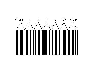
Reading around the pencil blogosphere it seems that some consider a printed barcode on the pencil's barrel to be alien to the character of the pencil. Here's an example of a pencil review where the reviewer has welcomed one manufactuer's efforts to avoid printing a barcode on the side. In that case, the manufactuer, Caran d'Ache, has resorted to a removeable plastic sleeve with the barcode printed on it. This seems to me to be an elegant solution, though probably a relatively expensive one. Others have tried to use a sticker - Tombow comes to mind here - but too often that leaves a sticky residue on the pencil once the sticker has been peeled off, which is unpleasant to use.
Whilst it is nice to see a clean, clutter-free design on a pencil, I do like to see the various pieces of information the manufacturer has put on it. Whether the manufacturer's name and trademarks, country of origin, a model number, the grade of the lead, those mysterious little codes embossed in the side but not painted, and indeed the barcode, they all add to the character of the pencil.
The problem of fixing a barcode to a pencil so that it can be scanned at a shop's till really has only one foolproof solution - print it on the side of the pencil itself so it cannot be peeled or picked off. This is what Staedtler and Faber-Castell do. I don't think they detract at all from the character of the pencil, and those manufacturers make them as discreet as possible anyway. I am sure that in future, if the pencils produced now are collected or used by pencil lovers, they will appreciate these symbols of our industrial society. Here's to the barcode.
Langganan:
Postingan (Atom)